


Listen to the audio version of this article. Duration: 5 minutes.
How the colours around us shape perception, emotion, and design
Colour comes from the way light, objects, and our brain interact. It is the first thing we notice, shaping our senses and giving meaning to what we see. Each colour is an experience created by this interaction, and designers know how to use it effectively.
Colour as an activator of wellbeing in the home: this is the guiding principle of Dopamine Decor, which uses carefully chosen palettes to convey positivity, vitality, and balance.
The name comes from dopamine, the neurotransmitter that generates feelings of wellbeing in the brain. When light waves reach the retina, they are converted into electrical impulses sent to the hypothalamus, the area that regulates the endocrine system and influences our emotions.
Dopamine Decor precisely calibrates each colour choice to create home environments that lift mood through visual perception. The approach is holistic: every shade must be in dialogue with the other elements of the space.
Before shape and movement, there is colour
Before we perceive form or movement, it is colour that catches our eye, giving the first and most immediate information about what we encounter. This rapid response is the result of millennia of human evolution: we register colour first, then movement, and finally the position of objects, animals or people.
What we call “colour” is simply the result of an invisible dialogue between light, the object and our brain. Light travels in waves, some long and others short. When it strikes an object, part of the waves are absorbed while the rest are reflected and reach our eyes. The receptors in the retina then convert this light into electrical signals, and the brain completes the process by interpreting, recognising and assigning meaning. Colour is not an intrinsic property of an object but a constructed perception that changes with the light, the context and our perceptual system. Each colour is therefore a sensation born of interaction.
This perception is one of the most influential factors in decision-making, as numerous scientific studies confirm. People form a mental image of a product in about 90 seconds, and more than half of that impression is based on colour. Colours also stimulate the brain through neurological connections, activating areas linked to the limbic system and the hypothalamus, which regulate mood, energy, appetite and even stress.
Although cultural context plays a decisive role, there is also a universal convergence around certain colours. Our reaction to a hue is partly subjective, but it is helpful to recognise which colours make us feel better, so that we can bring them into our spaces and communities.
In the psychology of living, nothing is neutral
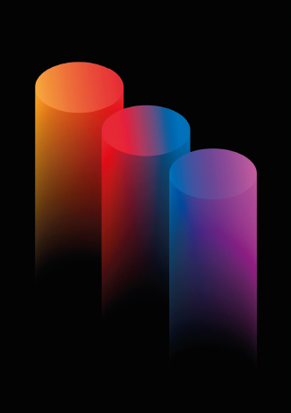
According to the Munsell Colour System, an internationally recognised classification, colours are defined by three main attributes: hue (such as red, yellow, green, blue, and violet), value (brightness), and chroma (saturation or intensity). This framework is essential for understanding how colour shapes perception and emotion.
The value we unconsciously assign to different colours comes from instinctive reactions. Warm, light colours increase muscle tension, raise heartbeat and breathing, and encourage movement. Dark, cool colours have the opposite effect, promoting calm and a sense of self-sufficiency.
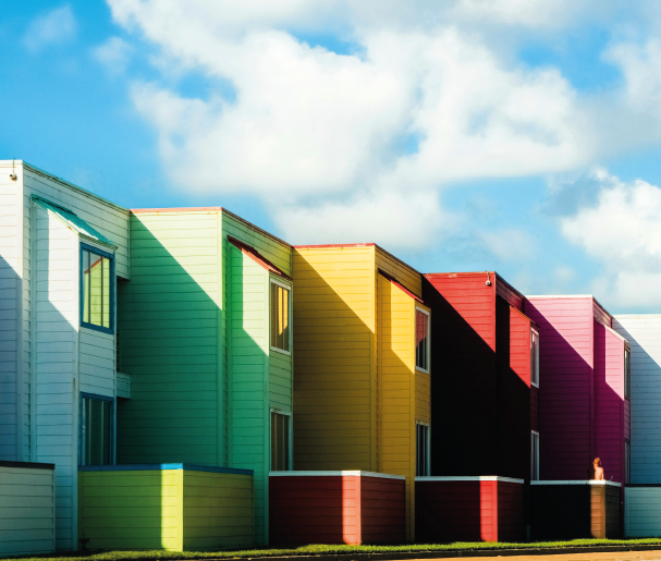
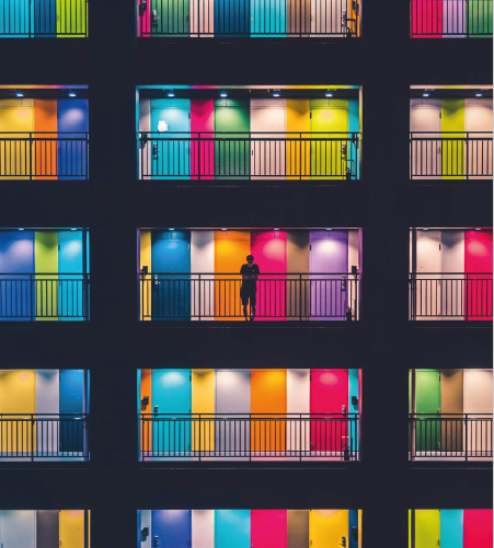
Research also shows that colours such as orange, light blue, pink, or green, especially at certain levels of brightness or saturation, can evoke memories of carefree childhood or joyful, light-hearted moments. This effect is particularly strong for colours we encounter in nature. Our minds also interpret tonal variation spatially: we know that distant objects appear paler and less defined. This is why cool colours seem further away and can visually expand a space, particularly when they are lighter, while warm colours appear closer and can make a space feel smaller, especially when darker. We also know that bright colours tend to trigger positive emotions, while black evokes both positive and negative responses and is often favoured by young people. Its popularity in fashion and marketing likely comes from its associations with power, mystery, seduction, and rebellion, all of which can be highly appealing to consumers. Red can enhance competitive performance; blue and green support reasoning and problem-solving; yellow energises and captures attention; brown conveys seriousness and reliability. Yet blue, in some contexts, is associated with sadness, just as white can symbolise purity in Western bridal traditions but emptiness or death in parts of Eastern culture. Colours also affect how we perceive depth. Fixed colour groups are often associated with artificial elements, while varied or changing colours remind us of nature and the passing of time. Similarly, muted or darker shades tend to recede into the background, while bright and vivid tones stand out in the foreground. This contrast can dramatically change how we experience a space. For example, painting walls in darker, muted colours can make a room feel more spacious than it actually is.
What can affect our psyche, however, is monochromy in interiors, which causes visual strain and a sense of psychological oppression.
Why 2025 Needs These Colours
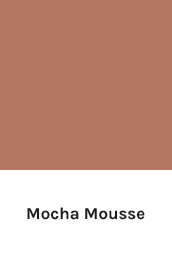
This year’s colour palette speaks not only to aesthetic sensibilities but to the emotional and cultural undercurrents of our time. Mocha Mousse, with its warm, enveloping tone, evokes a sense of comfort, intimacy, and quiet nostalgia—an anchor in uncertain times. In contrast, Transformative Teal points to a world in motion: forward-looking, fluid, and grounded in sustainability. Together, they form a chromatic dialogue between stillness and change, expressing the dual need for both emotional refuge and conscious transformation in 2025.
Mocha Mousse (Pantone 2025): The colour of balance
The Pantone Colour Institute has announced Pantone’s Colour of the Year 2025: Mocha Mousse, a warm brown that blends easily into any setting. Soft and reassuring, it suggests connection and harmony, evoking milk chocolate and coffee foam. In colour psychology, brown is linked to security and stability, drawing on its association with the earth and tree trunks as symbols of balance. Mocha Mousse was selected to reflect the search for calm in an increasingly fast-paced world. It encourages us to slow down, reconnect with nature, and find inner peace. Ideal for wall colours, furniture bases, or textiles.

Transformative Teal: The colour of 2026 for a changing world
In 2026, colour will be more than an aesthetic choice: it will serve as a powerful signal of change. WGSN and Coloro, two of the world’s leading trend forecasting agencies, have named Transformative Teal as the Colour of the Year (Teal is a deep greenish-blue shade, named after the small duck with a distinctive stripe of this colour around its eye).
Born from the fusion of dependable Deep Blue and Aquatic Green, this shade is intended to reflect an era of transition and reorientation. According to WGSN, 2026 will be defined by a growing collective need for urgent transformation in social models, production systems, and our relationship with the environment.
Transformative Teal enters this landscape as a symbolic colour, evoking resilience, regeneration, and connection with nature. It is no coincidence that greens and blues are gaining prominence: Google Trends shows that searches for “teal” have risen by 9% year on year, reflecting a widespread desire for balance, stability, and an ecological outlook.
It speaks of fluidity, bridging nature and technology, emotion and rationality, aesthetic desire and environmental urgency. It conveys both sustainable futures and inner wellbeing, carrying a promise of renewal. For brands, it is also a strategic lever: a recent WGSN study shows that 98% of consumers say colour influences their purchasing decisions.
Making Sense of the Colour Maze
From Pantone to HEX: why do so many systems coexist, and how do designers navigate them? There is no single universal language of colour; instead, multiple systems have developed over time, each designed to meet different professional needs:
Pantone was launched in the 1960s for the graphic arts, ensuring that a logo, a fashion fabric, or a printed brochure would look the same everywhere.
RAL, born in Germany in 1927, was designed for paints and coatings in industry, construction, and signage. Today it includes several collections (Classic, Design, Effect) used across Europe.
NCS (Natural Colour System) was developed in Sweden from the 1960s and officially published as a standard in 1979. It is based on six elementary colour perceptions (white, black, red, yellow, green, blue) and is widely applied in architecture, interiors, and product design.
Munsell (1905) was one of the first scientific attempts to classify colours using three dimensions: hue, value (lightness), and chroma (intensity).
Still today it is used in education, art, restoration, and even in soil and earth science.
CIE colour spaces (since 1931) are the international scientific standards based on human vision. CIE XYZ and CIELAB provide the foundation for colour measurement, calibration, and digital imaging worldwide.
These systems coexist because each serves different needs, from graphic design to architectures, but they are not interchangeable, and that often causes confusion.
Why does the same colour look different on screen, paper and materials?
We expect a colour to be absolute, yet in reality its perception changes depending on device, medium, and environment.
On screens
Colours shift because each display has its own calibration and technology. A smartphone with an OLED panel could render the same RGB values slightly differently from an old LCD monitor. Ambient light, screen coatings (matte or glossy), and brightness settings also affect perception.
In print and on materials
The same ink looks different on glossy or matte paper, and even more so on plastic, fabric, or metal. Finishes such as satin, matte, or gloss, can alter vibrancy. There are no official conversions between systems like Pantone and RAL: at best, one can find the closest match. Custom inks or paints can reproduce a precise hue, but this often involves higher costs and complex processes.
Human perception
Colours also change with lighting. A sample may match perfectly under daylight but appear different under LED light, a phenomenon known as metamerism. Surrounding colours and contrast can trick our eyes, and individual perception varies with age or vision differences.
Digital colour models: Speaking the language of screens and print
In the digital world, colour is described with mathematical models that allow it to be displayed consistently across devices and media:
RGB (Red, Green, Blue): the additive model of light, used by screens, cameras, and digital devices.
CMYK (Cyan, Magenta, Yellow, Black): the subtractive model of inks, used in printing.
LAB (or CIE L*a*b*, where CIE stands for Commission Internationale de l’Éclairage): a device-independent model based on human vision, used for calibration and as the universal reference in colour management.
HSB (Hue, Saturation, Brightness): an intuitive way to describe colours by type, vividness, and lightness; common in design software. HEX: a six-digit alphanumeric code that represents RGB values, the standard for web and digital graphics.
These models don’t replace Pantone, RAL, or NCS, but they ensure that colours look as consistent as possible when moving from a smartphone screen to a printed catalogue.
Copyright © Homa 2026
All rights reserved


@1x")